ENGINEER YOURBRAND IDENTITYFOR GROWTH
We design brands as scalable systems — built to convert, differentiate, and dominate in AI-driven markets.
01 — BRAND ESSENCE
What TechMarketing.AI stands for
The brand sits at a rare intersection — the organic intelligence of growth (tree/brain metaphor) and the precision of machine systems (circuits, data flows).
Measurable, AI-Driven Growth
ROI, conversions, and scalable growth.
Intelligent & Approachable
Enterprise smart + human connection.
Tech-Forward, Business-Minded
AI → revenue, efficiency.
The Sage + The Magician
Knowledge + transformation.
Nature Meets Machine
Organic + precision intelligence.
Build. Scale. Automate.
Our core brand promise.
02 — COLOR SYSTEM
Brand Colors
Signal Orange
Primary brand color. Used for CTAs, key headlines, logo mark. Conveys energy, confidence, and growth momentum.
Circuit Blue
Secondary color. Used for tech elements, links, data visualizations. Signals trust, intelligence, and precision.
Deep Ink
Primary background for digital dark-mode. Creates depth and makes the orange/blue palette electrifying by contrast.
Parchment White
Light-mode background. Slightly warm (not pure white) to keep energy human and avoid clinical coldness.
Brand Gradient
Orange → Blue diagonal gradient. Used for feature highlights, hero sections, animated elements. Never overused.
Neutral Mist
#6B6B7A · Supporting body copy color, captions, metadata. Never used for anything important enough to need emphasis.
03 — TYPOGRAPHY
Type System
Three-font system: a display font with character, a clean workhorse for body, and a monospace for technical data/labels — reinforcing the brand's dual nature of intelligence and humanity.
DISPLAY / HEADLINES
Syne · Bold 700–800
Build. Scale.
Automate.
BODY / UI TEXT
DM Sans · 300–500
We leverage cutting-edge artificial intelligence to supercharge your marketing strategy, drive measurable growth, and deliver results that compound over time.
LABELS / CODE / DATA
Space Mono · 400
AI AGENTS · AUTOMATION · SEO
TYPE SCALE (PX → REM)
04 — LOGO USAGE
Logo Application & Clear Space
The logo's tree–brain–circuit icon is the brand's visual anchor. It should always breathe — minimum clear space equal to the height of the letter "T" in the wordmark on all sides.
PRIMARY — DARK BACKGROUND

BUILD. SCALE. AUTOMATE
LIGHT BACKGROUND
BUILD. SCALE. AUTOMATE
ORANGE BACKGROUND
BUILD. SCALE. AUTOMATE
GRADIENT / PHOTO BACKGROUND
BUILD. SCALE. AUTOMATE
Logo Don'ts
Do not recolor the logo in any color outside the brand palette
Do not stretch, skew, or alter proportions
Do not place on visually competing backgrounds without overlay
Do not add drop shadows, outlines, or glow effects to the wordmark
Do not use below 24px height — use icon-only mark instead
Do not separate the icon from the wordmark unless using the standalone icon variant
05 — BRAND VOICE
Tone & Language
The brand's voice is how it sounds when no one's looking — in CTAs, error messages, onboarding emails, and LinkedIn posts. It should feel consistently expert–but–human.
How to speak
DO- →Lead with outcomes, not features — "Increase conversions" not "Our AI does X"
- →Use confident, direct language — "We deliver" not "We aim to deliver"
- →Anchor claims in evidence — cite only results the business can show, never "huge growth"
- →Sound like a sharp advisor, not a salesperson
- →Short sentences. Active voice. One idea per sentence.
- →Use "partner" and "together" — collaborative framing
- →Name the transformation — before/after storytelling
What to avoid
DON'T- →Avoid jargon without explanation — "LLM inference pipeline" in hero copy
- →Never use buzzword soup — "synergistic AI-powered paradigm shifts"
- →Don't be timid — "We might be able to help" kills trust instantly
- →Avoid passive voice — "Results are generated" → "We generate results"
- →Don't use exclamation marks in professional contexts
- →Never promise without proof — always cite the stat, the case study
- →Avoid robotic, cold copy that sounds machine-generated
VOICE PILLAR 1 — CONFIDENT
"We've scaled over 500 campaigns. We know what drives growth."
VOICE PILLAR 2 — HUMAN
"Tell us where you want to go. We'll build the path."
VOICE PILLAR 3 — PRECISE
"180% more conversions. 30% less ad spend. Same audience."
06 — DIGITAL APPLICATIONS
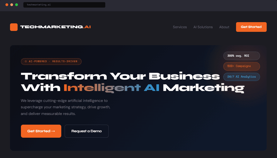
Website Hero Mockup
Strong typographic hierarchy, and generous use of the gradient to direct the eye to key CTAs.
Deep Ink and Parchment are both primary surfaces. Neither is the default. The medium decides: the web leads with Parchment and drops into Deep Ink for sections that need weight — pricing, proof, closing calls to action — while out-of-home and social work the other way, using Deep Ink for impact at distance. The mockup below is one expression of the system, not the rule. What stays constant across both is the typographic hierarchy and the gradient carrying the eye to the CTA.
The System, Applied — Live Components
Button — @/components/ui/button
The ai variant is Signal Orange and hovers to Warm Accent; ai-blue is Circuit Blue hovering to Sky Accent. Both read their colour from the same custom properties as the swatches in section 02.
Card — @/components/ui/card
AI Agents
Autonomous systems for repetitive marketing work.
Card surface, border and muted text all resolve from the token scale — no card on this site declares its own colour.
Heading scale — bare h2 / h3 / h4, styled only by app/globals.css
Engineer your brand identity for growth
Measurable, AI-driven outcomes
Build. Scale. Automate.
These carry no utility classes at all. Their family (Syne), weight, tracking and fluid size come from the base layer in app/globals.css, which is what every heading on every page inherits.
07 — MOTION DESIGN
Animation Principles
Motion should always serve a purpose — guiding attention, confirming actions, or expressing the brand's energetic–but–controlled character. Never decorative without reason.
Pulse — Alive & Breathing
Used for: Live indicators, AI "thinking" states, active data feeds. Signals that intelligence is at work behind the scenes.
ease-in-out · 2s · infinite
Slide — Directional Progress
Used for: CTA hover states, result reveals, onboarding flows. Implies forward momentum and progress.
ease-in-out · 2.5s · translateX
Breathe — Brand Pulse
Used for: Hero section accents, logo mark animation. The glow represents the brand's living, intelligent nature.
ease-in-out · 3s · scale + box-shadow
Orbit — Continuous Intelligence
Used for: Used sparingly: Loading states, AI processing indicators. Slow, calm rotation — not urgent, but persistent.
linear · 4s · rotate(360deg)
08 — SOCIAL MEDIA
Content Templates
Each post type has a defined visual grammar. The brand should be instantly recognisable in a crowded feed — even without the logo visible.
CASE STUDY
$50K → $500K
in 6 months.
TM.AI
INSIGHT
AI doesn't replace
marketers. It makes
them unstoppable.
TM.AI
TAGLINE
Build.
Scale.
Automate.
TM.AI
CONTENT PILLARS
Proof Points
Client wins, ROI stats, case studies
AI Education
Demystifying AI for business owners
Insights
Market trends, hot takes, predictions
Behind the Brand
Team, process, culture — humanizing AI
Lead Magnets
Free audits, checklists, demo offers
09 — SPACING & GRID
Spatial System
An 8px base grid governs all spatial decisions. The system creates visual rhythm across all digital and print touchpoints.
Visual Hierarchy & Scaling
8px
XS
16px
S
24px
M
40px
L
64px
XL
96px
2XL
128px
3XL
10 — BRAND DIFFERENTIATION
Competitive Positioning Matrix
Where TechMarketing.AI sits versus the category — and how the visual identity reinforces those advantages.
Landscape Comparison
11 — ICON SYSTEM
Iconography Style
Icons follow a line-based style with rounded terminals — human and approachable. The orange/blue dot accent (mirroring circuit nodes in the logo) can appear at icon endpoints for branded moments.
Icon Taxonomy (Applied)